P2
P2


For the mood board which I have created, I decided to include a colour swatch of yellow to different shades of red, the reason which I included this vibrant colour within my mood board is because I believe these colours will work well within my advertisement as they are colours which will stand out to my targeted demographic of younger children. I have also decided to include pictures of apples within my mood board, this is because I have took inspiration from these apple pictures and it is what I am wanting to similarly use for my logo design.
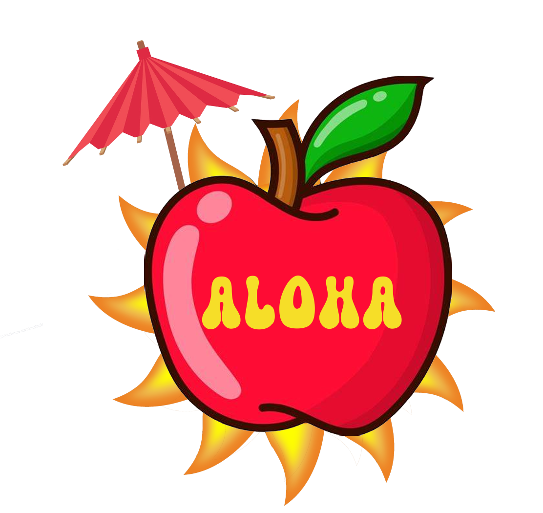
For my logo I wanted to give it a summer vibe so I added a sun behind the logo of the apple and stuck an umbrella into the apple, then I added a more summery or hipster looking font to add to the summer image, I made the text yellow to match the sun and add contrast to the logo, the main two colour themes of my brand are yellow and red.

This is the finished design of my product, I decided to give the main colour of the can a darker yellow to still stick to the theme of the brand colours but not ruin the look of the brand logo by blending in with it. I decided to put flames along the bottom of the can to stick to the theme of the sun and summer time, and due to the brand being targeted towards younger children I wanted to give the can a more fun and less serious look. For the ingredient information on the front I wanted to use the same font as the logo but in a different colour of red to contrast the background of yellow but keep the theme of red and yellow.

Within the print advertisement sketch there was many different choices which I had made to create a visually appealing and professional poster during the main production. The first main choice which I had made was to use the "Magic bloom" font which fits the summer theme which I was aiming for within my advertisement. The second significant choice which I had made was to put the logo enlarged in the center of the poster so that this becomes the main focus of the advertisement. I also decided to include a slogan in large text at the bottom of the poster so that once the viewer had seen the logo, they would then decide to see what the poster is about through the slogan. For my print ad I decided to use a yellow background with red text for the slogan, this is because I wanted to stay with the vibrant theme while also making yellow and red the main theme for the Aloha product, this also reflected within the web advertisement as I wanted to be consistent with the theme of my advertisements.

Within the web advertisement sketch there was many choices which I decided to make to keep up with the professional advertising standard, however I decided to use similar assets as the print ad but in different positionings as I wanted to keep consistency within my advertisements as I had mentioned in the previous paragraph. The main significant design choice which I made within my web advertisement was that I decided to make the logo smaller than the slogan, this is because I wanted to capture the attention of the viewers as there is many other things that they would be viewing within the website, this means that there is a higher chance of the viewer ignoring my advertisement.


Comments
Post a Comment